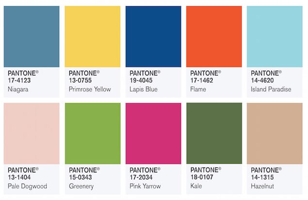
Out with the sweet pastels – PANTONE Colour Institute has finally unveiled its top colour picks for Spring 2017 in conjunction with New York Fashion Week. Reminiscent of hues that surround us in nature, Kale and Hazelnut are more than just food – they’re now two of the ten colours unveiled by the self-proclaimed colour authority.
1. Lapis Blue

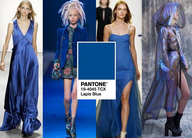
Lapis Blue is a gorgeous, intense shade of blue that is statement at best. It is a perfect shade for colour blocking – think blazers, trench coats and pencil skirts – or simply in a one piece ensemble as seen on the runways of NYFW.
2. Primrose Yellow

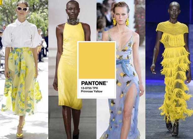
This muted shade of yellow a reminder of flowers blooming in Spring. Radiant yet subtle, this warm hue would compliment sun-kissed skin best, playing up your healthy glow from within.
3. Island Paradise
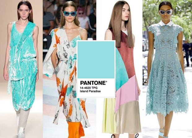
The name of this colour could not be more apt – this refreshing shade of blue is reminiscent of tropical waters at the perfect beach holiday. Lela Rose did this hue justice in a lace midi dress, as did Christian Siriano, who combined the light blue with Flame – another one of PANTONE’s picks for Spring 2017.
4. Flame

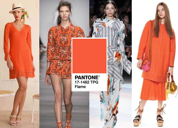
Vivacious and daring, Flame is red-based orange made for parties. You’re definitely going to turn heads with this – for all the right reasons.
5. Pale Dogwood

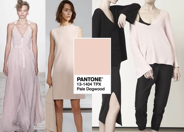
A close cousin of the ever-popular Rose Quartz, Pale Dogwood strikes a balance between girly and sophistication. This is an unobtrusive shade of pink that will dominate the sartorial world in the form of chic bomber jackets, peg trousers and shift dresses. Fashion is rethinking pink – less of Barbie, more of your wearable blusher palette.
6. Greenery

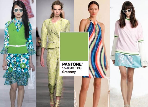
Greenery is a bright shade of yellow-green that screams avocado on toast – a staple in the world of brunch. From printed shirts to co-ords, this is an adventurous colour to experiment with in the coming season.
7. Pink Yarrow

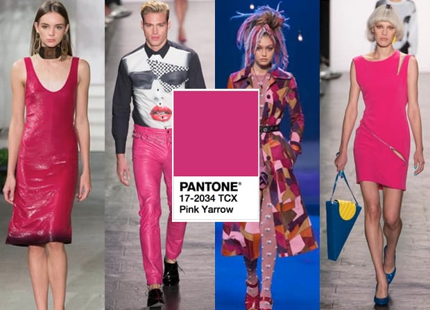
A festive number that injects an element of fun into any outfit, Pink Yarrow is a captivating shade of pink that elevates any piece of clothing to statement status. For the less adventurous, this hue can be toned down a notch by subtly incorporating it into your outfit in the form of accessories.
8. Kale
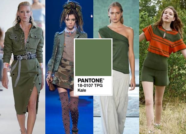
Kale is a lifestyle, and its soaring popularity among millennials now extends beyond detox juices and salads. This shade of green gives one a safari luxe aesthetic, complementing whites best.
9. Hazelnut

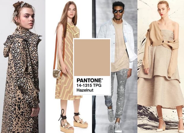
A quintessential neutral that goes with just about anything, Hazelnut is a must-have colour in your wardrobe. This understated shade has been styled to death by the Kardashians. When it doubt, always go for neutrals.
10. Niagara

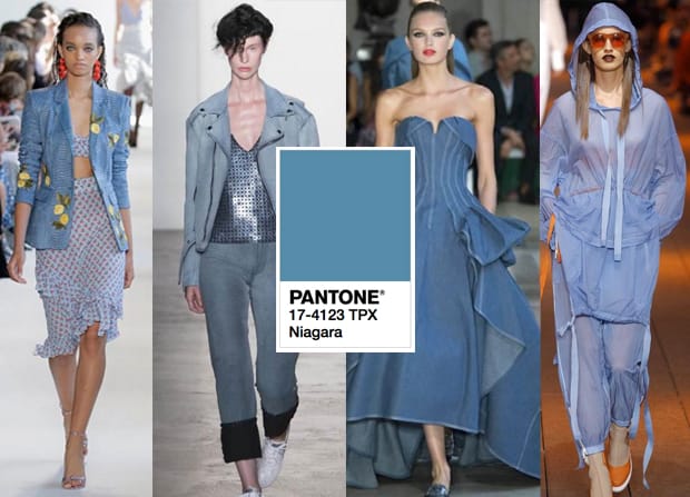
This denim-esque blue is evidently a prevalent hue on the runway, having been used in a ballgown, sequins on a v-neck cami top and a floral-printed denim jacket. Versatile and dependable like a good ol’ pair of jeans, Niagara is an everyday colour that is suitable for every occasion.
(Photo credits)
in Fashion

